
A screen can look solid and still fail basic accessibility.
I was reminded of that while testing a demo app with TalkBack.
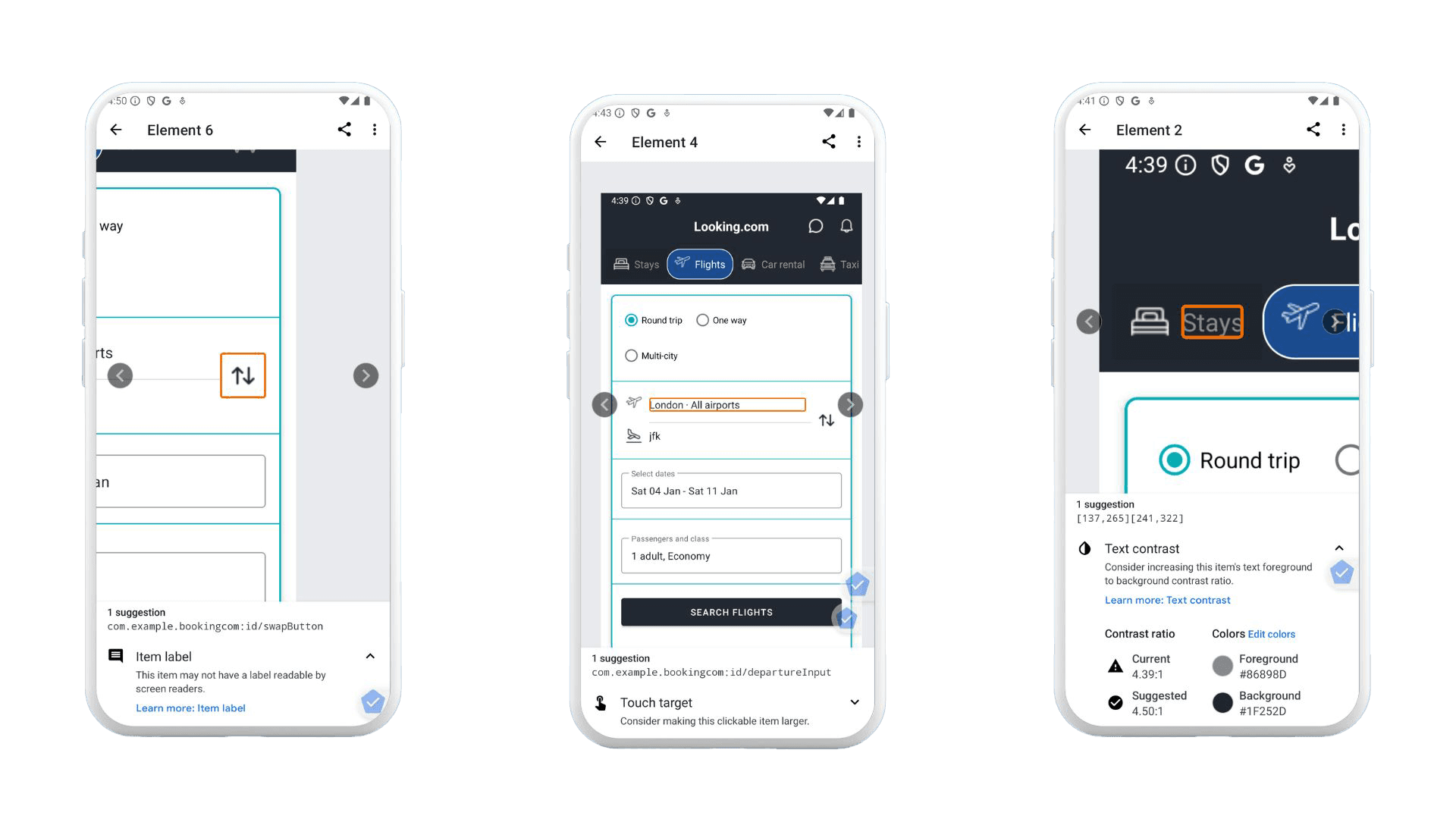
It was a tidy flight search screen: trip-type toggles (round trip, one way, multi-city), From and To fields, a “Search Flights” button, and that swap icon you tap to switch departure and arrival. Nothing fancy. I ran the feature, clicked around, everything behaved. Ship it, right?
Then I turned on TalkBack.
The first thing it said was: “Button. Unlabelled.”
Not once. Twice. No hint what those controls did. The page looked clean, but it sounded like a mystery novel with the pages out of order. One of them was the swap-between-airports control; the other was in the passenger selector (the plus/minus for adults). Both were unlabeled. And that’s the thing with accessibility on Android: your UI can be visually fine and still be unusable for someone using a screen reader, switch access, magnification, or the keyboard.
So let’s make this practical. This guide walks through a repeatable workflow for testing accessibility on Android using both a physical device and an emulator, mixing manual testing, automated scanning, and WCAG validation. No hand-waving. Just steps you can run every sprint.
Why Android accessibility testing is worth your time (even when you’re very busy)
If you build Android apps for real humans, you’re already building for people with different needs. Some users navigate with TalkBack. Some use Switch Access. Some crank font size up because… well, because they need to read. Others use external keyboards on Chromebooks or tablets. And Android runs across a wonderfully chaotic ecosystem of screen sizes, OS versions, and manufacturer tweaks.
Accessibility testing helps you:
- Catch defects earlier (when fixes are cheap, not terrifying)
- Support more users across visual, motor, cognitive, and auditory needs
- Reduce legal and operational risk by showing due diligence and traceability
- Improve overall usability (a lot of accessibility bugs are also plain old UX bugs)
Also, Android’s gesture patterns and custom UI components can break accessibility in ways automated tools simply don’t notice. You can run scans all day and still miss the exact moment a dialog traps focus or a validation message never gets announced.
What you need before you start
You can test on a physical device, an Android Studio emulator, or ideally both.
Here’s a sensible baseline:
- A recent Android device (anything you can spare is fine; a mid-range phone is often more realistic than a flagship)
- Android Studio emulator with an API level close to what you support in production
- Your app installed as a debug/test build
- Internet access (mainly for installing Accessibility Scanner)
- A tiny bit of patience for Android settings menus
Emulator vs Physical Device:
When I reach for the emulator, I'm prioritising speed and consistency. It's my go-to for regression testing because it gives me identical environments every time, and I can quickly spin up coverage across different API levels and screen sizes without juggling multiple physical devices. When I'm triaging a bug and need to reproduce it fast, the emulator lets me reset to a clean state instantly and iterate rapidly through potential fixes.
When I reach for a physical device, I'm doing the validation work that really matters before release. That's when I need to verify gesture accuracy, check that timing and responsiveness feel right to actual users, and test the things emulators can't quite replicate—external keyboards, physical switches, and real-world TalkBack behaviour. The emulator gets me most of the way there, but the device gives me confidence that the experience will actually work in people's hands.
If you only do one: start with the emulator. If you want fewer surprises: finish on a real device.
Step 1: Enable Android accessibility tools (device + emulator)
Turn on TalkBack (screen reader)
TalkBack is Android’s primary screen reader. It announces UI elements and lets users navigate via gestures or keyboard controls.
On a device or emulator:
- Open Settings
- Go to Accessibility
- Select TalkBack
- Toggle On
- If the tutorial appears, it’s worth doing once—just to learn the rhythm
A few TalkBack gestures that matter in testing:
- Swipe right / left: move focus forward/back
- Double-tap: activate the focused element
- Two-finger swipe: scroll
Emulator note: gestures can feel awkward with a mouse. Make sure you’ve enabled keyboard input and you understand how to simulate touch gestures in the emulator controls. It’s not perfect, but it’s good enough for navigation order, announcements, and a lot of UI validation.
Install and enable Accessibility Scanner
Accessibility Scanner performs automated checks and flags common problems like contrast, small touch targets, and missing labels.
Typical setup:
- Install Accessibility Scanner from the Play Store
- Open it and grant permissions
- Launch your app
- Use the floating scan button on each screen
Scanner is helpful, but it’s not a judge and jury. Treat results like a smart coworker pointing at suspicious spots—not like a full audit.
Optional tools that often reveal hidden issues
Depending on what your app does, also try:
- Switch Access: for switch and keyboard-like navigation patterns
- Magnification: to validate zoom and interaction at scale
- Font size / display size: to see whether layouts survive larger text
- External keyboard: especially if you support tablets/Chromebooks
Here’s a small digression that pays off: once a quarter, I set font size to “huge” and open the app like a regular user. You’d be surprised how many “perfect” screens turn into overlapping chaos. It’s not glamorous work, but it’s very real.
Step 2: Manual testing with TalkBack (this is the core)
This is where the real value is. The rule is simple:
Navigate every screen with TalkBack only. Don’t use your eyes to “help.” Don’t tap where you think the button is. Follow focus.
1) Focus order and navigation
Check that:
- Focus moves in a logical reading order
- All interactive elements are reachable
- No focus traps exist in dialogs, sheets, or overlays
- Disabled or hidden elements aren’t announced as if they’re available
A common failure looks like this: focus jumps from a header to a footer, skipping the primary action. Visually it’s obvious where to tap, but TalkBack users experience a scavenger hunt.
Quick reality check I use: If someone can’t find the primary button within a few swipes, the screen probably needs work.
2) Labels and announcements
Listen to the announcements carefully.
You want:
- Clear, meaningful button labels
- Icons that announce their purpose (“More options”, “Search”, “Add to cart”)
- Images that either have appropriate descriptions or are correctly ignored
- Repeated elements that don’t become repetitive noise
If you hear “Unlabeled” or “Image” or “Button” with no context, that’s a defect. Sometimes it’s a missing contentDescription. Sometimes it’s a custom component that never set an accessibility label. Either way, TalkBack is telling you the user is stuck.
A small nuance: not every image needs a description. Decorative images should usually be skipped. Describing a divider line as “Image” is not helpful—it’s just clutter.
3) Roles and states (buttons should sound like buttons)
TalkBack should communicate:
- Role: button, checkbox, switch, tab, heading, etc.
- State: checked/unchecked, selected, disabled
- Expanded/collapsed status for accordions, menus, and dropdowns
Custom UI is where this goes sideways. If you’ve built a gorgeous toggle from scratch, make sure it still exposes the right semantics. Otherwise, TalkBack users may hear “Double tap to activate” with no clue what state they’re changing.
4) Dynamic content and feedback (the stuff that changes)
Trigger common behaviours:
- Form validation errors
- Toasts, snackbars, alerts
- Loading states and progress indicators
- Screen transitions and content refresh
Then ask: would a screen reader user notice?
A classic problem: an error message appears visually under a field, but TalkBack focus stays on the submit button and never announces the error. The user hits submit again. And again. Now they’re frustrated—and the app feels broken.
5) Keyboard and external navigation
If your app is used on tablets, Chromebooks, kiosks, or with external keyboards:
- Tab through interactive controls
- Activate using Enter/Space
- Confirm there’s a visible focus indicator
- Check that focus order matches expectation
Even if you think “mobile users don’t use keyboards,” some absolutely do. And accessibility users often rely on alternative input methods that behave like keyboard navigation.
Step 3: Automated testing
Accessibility Scanner: scan the main flows
Run scans on:
- Home screens, onboarding, login
- Primary task flows (purchase, booking, messaging, etc.)
- Forms and error states
- Key dialogs and bottom sheets
Pay attention to contrast warnings, touch target size, missing labels, and hierarchy issues. Then verify manually. Scanner can flag things that are technically fine, and it can also miss context-specific issues. It’s a strong assistant, not a replacement.
Android Studio checks: lint and layout validation
Android Studio can help you catch issues before a build ships through accessibility-related lint warnings and layout inspection that reveals hierarchy and focus order problems.
If you have CI, it's worth integrating lint checks so issues don't silently creep back in.
Emulator considerations (what it’s good for, what it’s not)
| 💪 Emulators are valid for: | ⚠️ Emulators are weaker at: |
|---|---|
| Screen reader behaviour (most of it) | Gesture fidelity and timing |
| Layout scaling and font size testing | Performance, latency, and animation delays |
| Navigation order checks | Hardware interactions (sensors, some peripherals) |
| Automated scanning |
So use the emulator to cover breadth, then use a physical device to confirm the “feel” and edge cases. That combination is where teams start shipping reliably accessible UX.
Step 4: WCAG validation (mobile interpretation)
WCAG can feel abstract until you map it to what you just observed.
A practical mapping looks like this:
| Principle | Requirements |
|---|---|
| Perceivable | • Text alternatives exist where needed • Contrast is sufficient for text and key UI elements • Content remains readable at larger font sizes and display scaling |
| Operable | • Focus order is logical • Touch targets are large enough and spaced well • No interaction requires a gesture with no alternative • Users can operate key flows without precision tapping |
| Understandable | • Labels and instructions are clear • Errors explain what happened and how to fix it • Navigation patterns are consistent across screens |
| Robust | • Works with TalkBack and other assistive tech • Custom components expose semantics properly • Updates are announced when context changes |
If your team needs compliance documentation, this is also where you build traceability: “Issue X violates Y criterion; fix was verified by Z test.”
Step 5: Regression and continuous testing (the unglamorous part that saves you)
Accessibility testing isn’t a one-off. It’s more like brushing your teeth—skip it for a while and you’ll regret it.
A sensible cadence:
- During feature development (quick checks as you build UI)
- During QA cycles (repeatable runs on key flows)
- Before major releases (device validation)
- After UI redesigns (expect regressions; they’re normal)
Track accessibility bugs explicitly. If they go into a generic “UI issues” bucket, they tend to reappear later like weeds.
Common Android accessibility issues (the repeat offenders)
These show up constantly across apps:
- Missing or incorrect
contentDescriptionon icon buttons - Focus trapped inside modal dialogs or overlays
- Duplicate or overly verbose announcements
- Custom controls without proper roles/states
- Touch targets too small or too close together
- Error messages that appear visually but aren’t announced
- Layout breaking at large font sizes
If you recognise your app in that list, you’re not alone. The fix is usually straightforward. The hard part is noticing it early.
A checklist you can paste into your test cycle notes
Use android accessibility testing checklist on every release candidate:
Final thought: do the boring checks early
Accessibility testing on Android isn’t mysterious. It’s mostly discipline and repetition—turn on TalkBack, follow focus, listen for confusion, run Scanner, confirm on a real device, and map what you found to WCAG.
And yes, it can feel slow the first couple of times. Then it becomes muscle memory. You start catching issues while you’re building the screen, not after a user reports it. That’s the moment it stops being “extra work” and starts being normal engineering hygiene.